Ever wonder about the kettle on the most famous UX book “Design of Everyday Things” by Don Norman? Why is that a book cover?

Don Norman believed that user experience needs to be set right for everything that a user can interact with. Hence, the kettle with a long neck and a handle on the wrong side indicating UX lies even in a kettle.
Nowadays the market believes that UX is meant for digital products like apps and websites, but what is it for a person who designs physical products?
Call it a luxurious seat for a Rolls Royce or a regular toilet seat, it doesn’t matter. The experience is what really matters. And one of the reasons why people spend much on premium stuff.
A bad User Experience
When can you say if a product has a bad user experience(UX)?
Simple, if it isn’t good enough.
Let’s take a look at some bad UX practices from the real-world before anything.

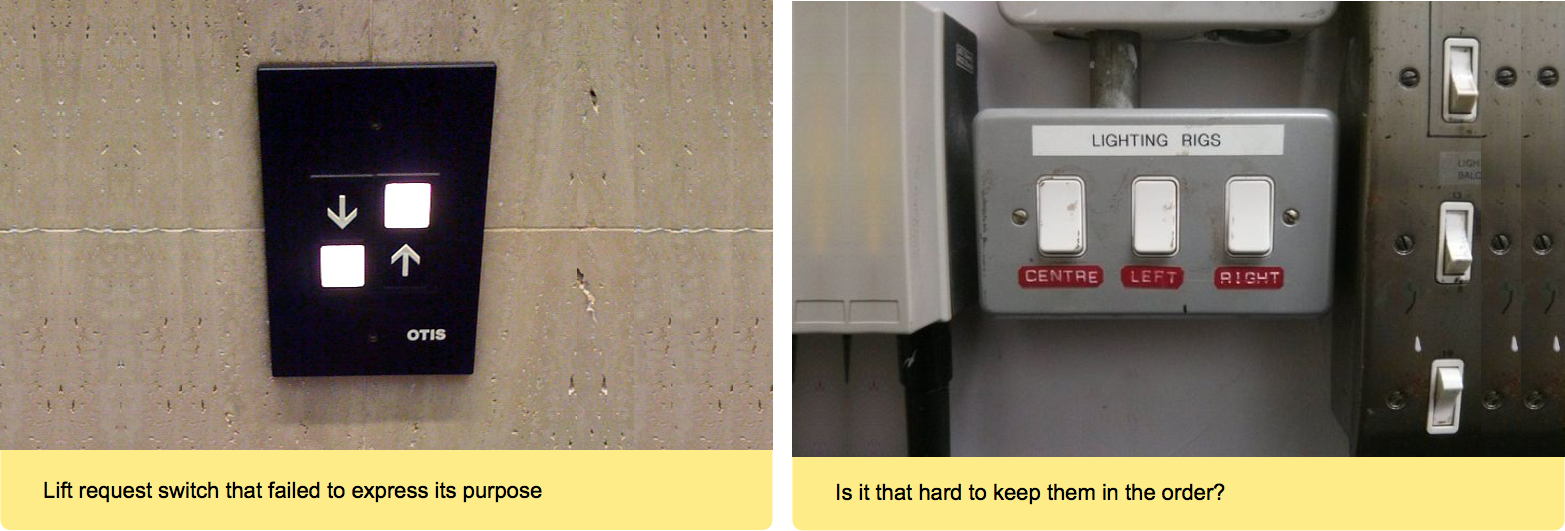
• “Visibility of System Status” — One of 10 NN Heuristics
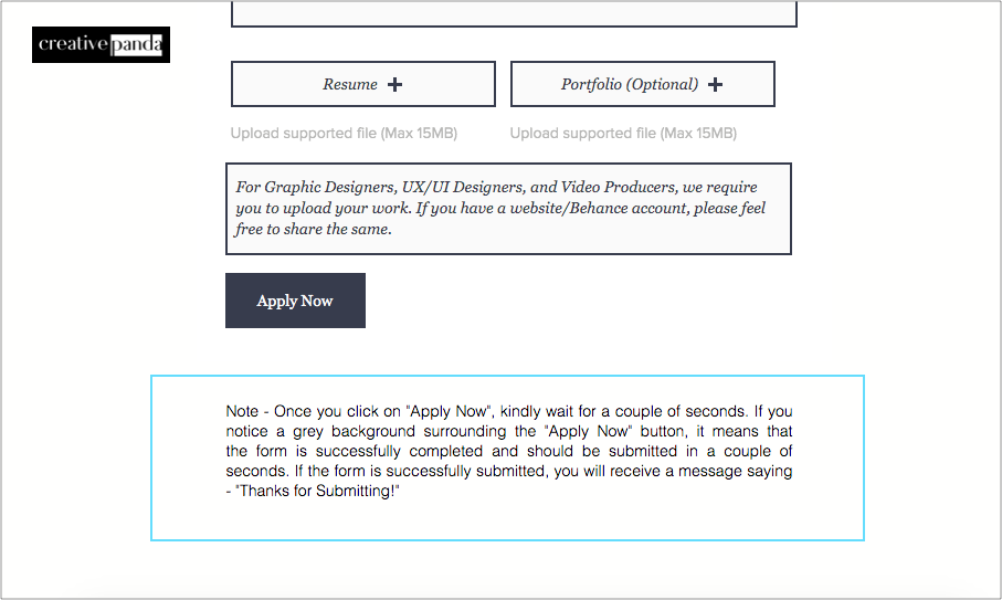
I don’t think neither Neilson nor Norman would’ve thought that people would take “Visibility of system status” so seriously. Creative Panda made it clear about what happens when they click on “Submit” in their UI.
I don’t say this is bad UX, as they’re keeping their users posted about what’s happening with the system. But this shouldn’t be the approach is what I can confidently say though.
Now, how do you validate if a product has good UX or bad UX?
Hmm, quite tricky!
There are several metrics that help us validate a product’s UX. I can tell you a few that you can use to validate UX for any product. Note that it is not necessarily true that a product should justify all the below conditions. Look for what applies to your product.
• Efficiency of Use
It is not necessarily true that if a product is functional it is easy to use. Look at the example of the tea kettle below. Both the left and the right ones are tea kettles and the world agrees to the fact that the right one is easier to use and it is the one most people would like to buy.
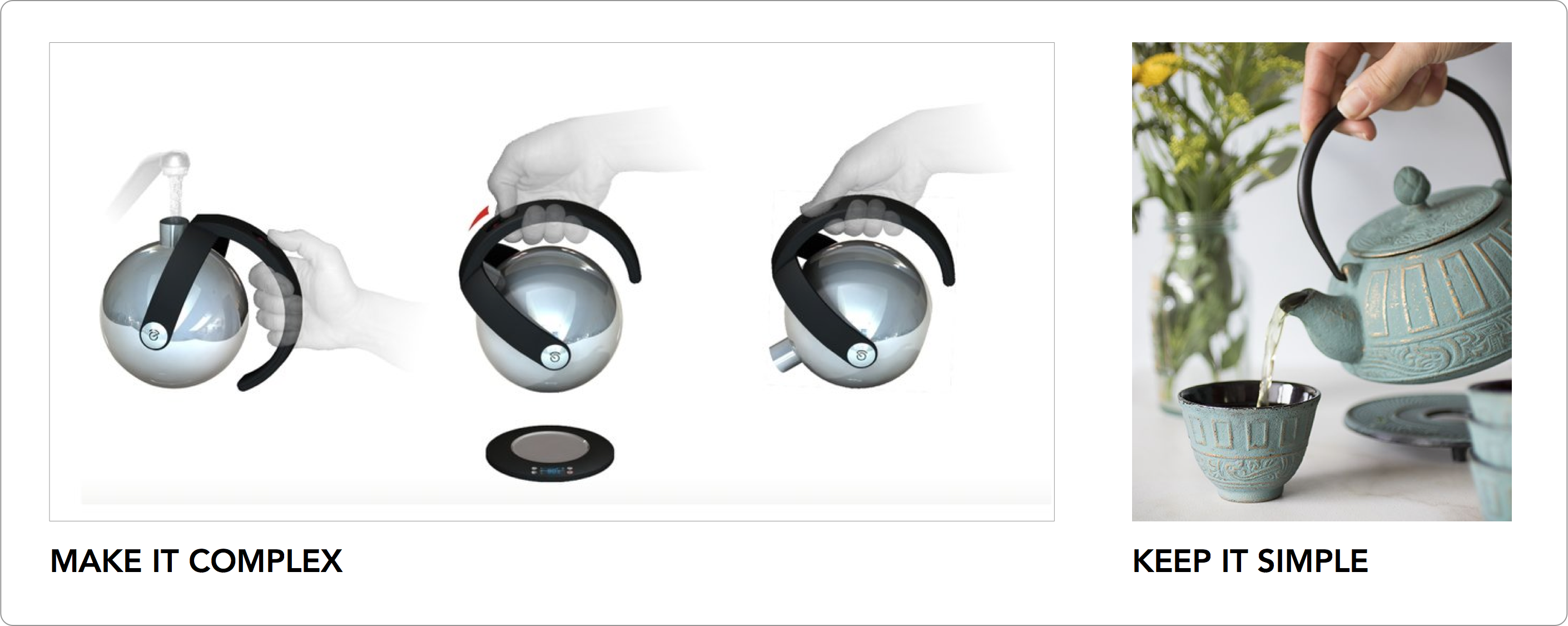
If a product is looking fancy enough to grab the attention but not easy to use, then it never serves the purpose of its existence.
• Affordance
Affordances are visual clues in the design. They imply how users should interact with something.
When it comes to everyday life, affordances are everywhere. They’re one of the main differentiators between well-designed products and bad ones. For example, take the humble door.
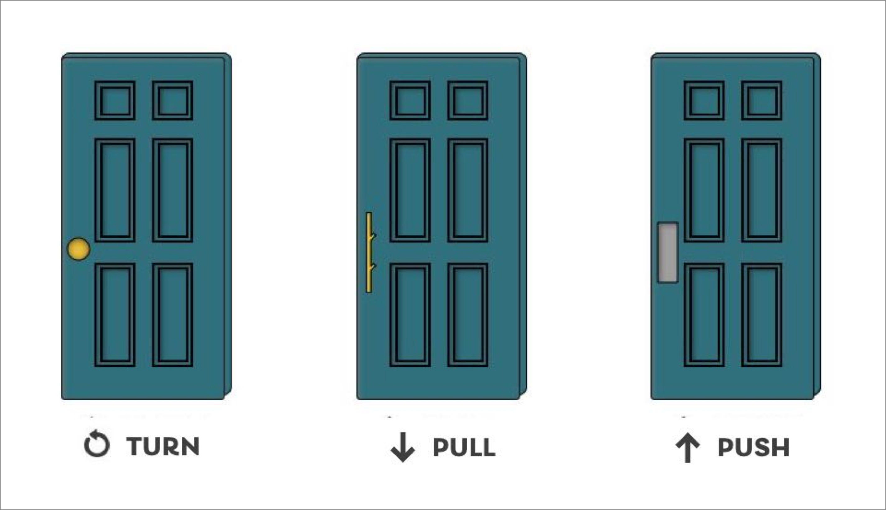
Affordances play an equal role in the design of digital UI. It all comes back to making things obvious.
Affordances make the ‘interactive stuff’ easier to pick out. They give the users clues about how they should interact and what will happen when they do.
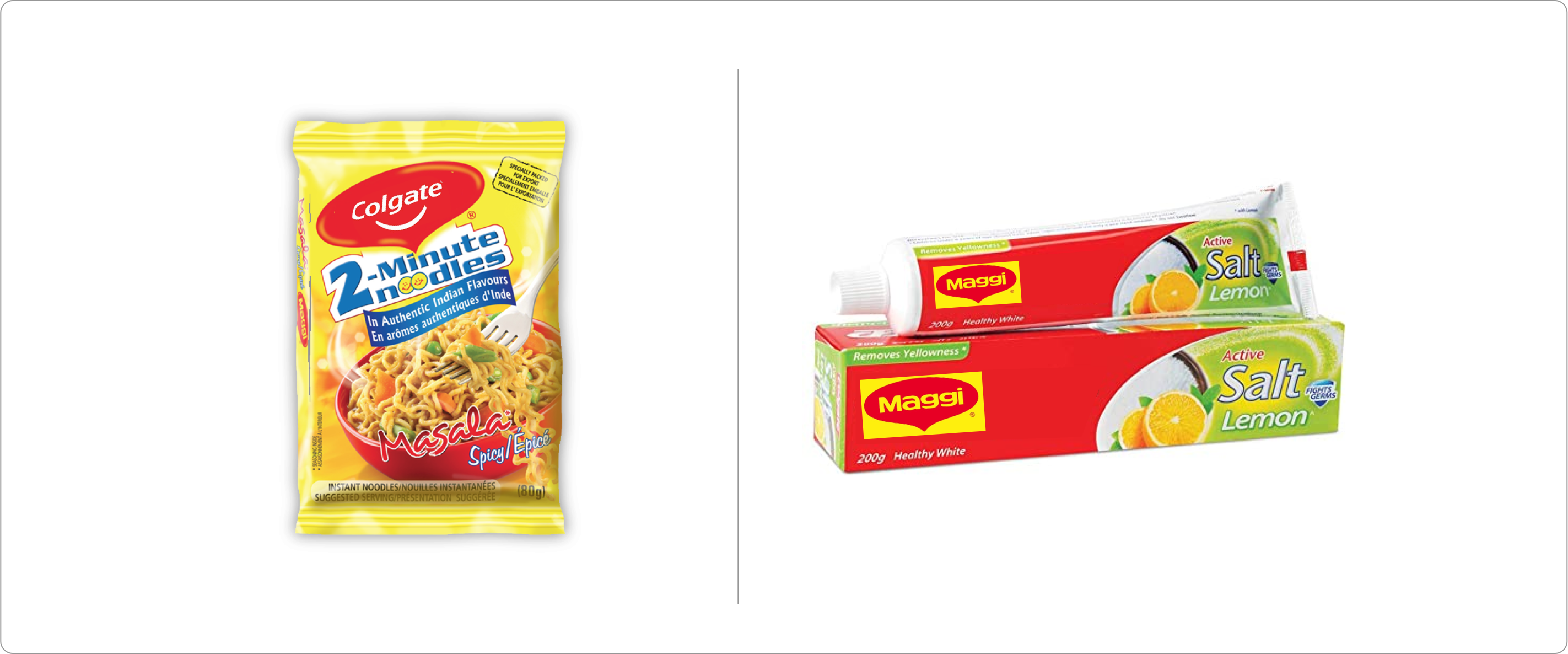
• Consistency & Standards
Call it a product feature or product itself, it should meet the expectations of users on how similar products are functioning in the market. For example, you won’t be excited to buy if Colgate is selling Maggi, do you?
• Legibility:
Any text on your product should be legible enough for people of any age group. For example, the most critical information on any food product is the Best before or Expiry date, many products have them in smaller letters or use fonts that are not legible. Because of which people might get sick with that product intake. So, it is important to have critical information legible for a different audience.

If you’re looking for something more focused on digital space, here’s a detailed article on 10 Usability Heuristics for User Interface Design at NNGroup. These heuristics can help us to validate UX flaws in any digital user interface.
As told earlier, UX is everywhere. It’s just that people won’t recognize it’s existence when it’s there. But when a product is not designed well, people say…
“There’s something not right about this product, can’t figure what is that.”
I’m telling you, next time if you ever feel the same about something, do a quick UX assessment with the above-mentioned metrics and see if it’s just you or it’s a flaw in the product’s design.
Let’s make the world a better place together.
System error?
No, it’s human error. Someone didn’t thought of it while designing.
About publication
Heading: Дизайн
Date of publication: 12 January 2021
Author: Avinash Bussa
Statistics: 13170 просмотров
Materials taken from the site: medium.com
Share this:


